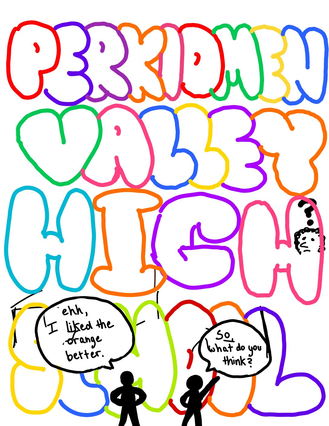
Why PV’s School Colors are Perfect
by Samantha Schoenewald
For years, the students at PVHS have been arguing over whether or not the school colors, orange and brown, should be changed.
Despite the overwhelming majority of individuals hating on these colors, the alteration of them should not occur.
Some students such as Izzy Delacruz, a ninth grader at PVHS, disagree with that statement. “It’s been proven that colors create and generate certain emotions and psychological effects. Not only is orange and brown disturbing to the eye but just unpleasing overall,” Delacruz says.
Though they might not be the most pleasing to the eye, the psychological effects of these two colors are actually very positive. According to psychologist and therapist Kenda Cherry and Adah Chung, the color brown represents being honest, genuine and sincere. It is related to being hardworking, industrious, and reliable. Cherry also states in an article from “VeryWellMind” that, “Orange is an energetic color. Orange calls to mind feelings of excitement, enthusiasm, and warmth.” The energy from these colors is everything a school should strive for their students to be; honest, hardworking, and enthusiastic. They represent PV perfectly.
Students like freshman Ella Luciano, also bring up the issue of the lack of orange and brown clothes to wear for spirit days. “Many people do not have those colors laying around in their closet,” Luciano says.
Many people might not go and buy an orange and brown sundress, but they probably do own at least one PV apparel item. If the school colors were changed, every student that owns a brown and orange t-shirt would not be able to wear it with full school pride.
“We would have to change all of our color schemes with the clothes and the school walls,” Vienna Li, a freshman, said. So, not only will all of the apparel go to waste and need to be rebought with the new school colors, but the whole architecture revolving around these colors would have to be altered.
Lastly, the most common argument from students across the district is that these colors are just plain ugly. “I think that orange and brown is just really weird looking,” eighth grader Ben Gerberich said.
Many may not realize, but orange and brown are seen on many different occasions where they are awed at. The orange leaves falling off the brown of a tree, coffee in a dunkin donuts cup, orange eyeshadow on brown eyes, and more. “Orange, brown, and white are nice compliments and there aren’t any schools around here with those colors,” Ninth grader Charlotte Hoy said.
Our colors are unique. Wouldn’t you much rather our colors be orange and brown than match half the schools in the country? Imagine going to a football game and not knowing who is cheering for home vs away.
Perkiomen Valley’s school colors, orange and brown, get way too much hate and should not be changed. They symbolize everything PV strives to be, are way prettier than they get credit for, and are unique. Altering these colors would force us to hide away all of the former apparel and spend heaps of money on new spirit schemes such as changing the color of our socks and painting the walls anew.
Decades of people before us have worn these colors with PV pride, why can’t we do the same?
Why PV’s School Colors Need to Change
by Sarah Strausberg
Let’s be honest, when someone lists good qualities of the Perkiomen Valley School District, the school colors – brown, white, and orange – are never included. Since the school colors aren’t appealing to the eye, brown can look tacky for sports uniforms, and black would be a refined option, Perkiomen Valley should change colors.
The school colors do not go well together. Orange and brown clash with each other, and can appear sloppy. Most schools have colors that are complementary neutral or primary colors. Spring-Ford uses blue and yellow, which are primary colors. While it’s important to be versatile, school colors are not the place to branch out. Orange and brown can blend together, creating an unattractive picture.
Perk Valley should also consider changing our school colors because most sports uniforms aren’t brown. Perk Valley athletics typically have one or two colors for games. The only sport that has more than orange and white is football. They have orange, brown, black, grey, and white. Since most uniforms aren’t brown, it doesn’t look like a color we represent.When attending sporting events, the school also doesn’t dress up in brown. Typically, students call for a “white out,” a “black-out,” or an “orange out.” Brown is considered an ugly color to wear, which most people don’t own.
If the school colors change, it should become black instead of brown. Black is a sleek option, that will look better on jerseys, school posters, and PV sponsored events. Black is a neutral color that goes well with anything, unlike brown which often collides with other colors. If the school colors change it would also bring buzz to the school, causing more students to have more school spirit. While it seems like a small adjustment, it could reignite the pride for Perkiomen Valley High School.
Perkiomen Valley is never considered for having the best colors. While the brown could be considered a necessity due to the long standing history of representing the Vikings with orange and brown, black is a better option.